Blog Layout
TYPOGRAPHY IS ALIVE & WELL ON THE WEB
Nick Brand explains how recent technological changes have enabled a return to true typographic values
"The long lost era of being limited to 'web safe' fonts is at last dead and buried. Many designers, me included, despised being limited to poor quality, badly cut and sloppy fonts. There was a time, not actually that long ago, when the fonts that could be safely used on any website were very limited - but thankfully we no longer have to rely on the likes of Arial, Times, Georgia, & Verdana in our creative.
The evolution of the web browser has helped us to consider broader combinations of fonts, with the only real limitation being our imaginations. The establishment of free Google Web Fonts and other font providers means that we can pretty much use (license permitting) any fonts we desire. And without wishing to bore, the technology behind this is really clever - essentially “serving” the font to whichever device you are using to view the website.
This is another positive step in bringing the world of digital design and printed design closer together, with many typographic principles coming into play in web based creations. And as I am always banging on about - helping to build the consistency vital for successful brands.
As a result designers all over the world have been pushing the boundaries to create stunning websites. Here are some of our current favourites, including our own work for Jack Brunsdon & Son.”
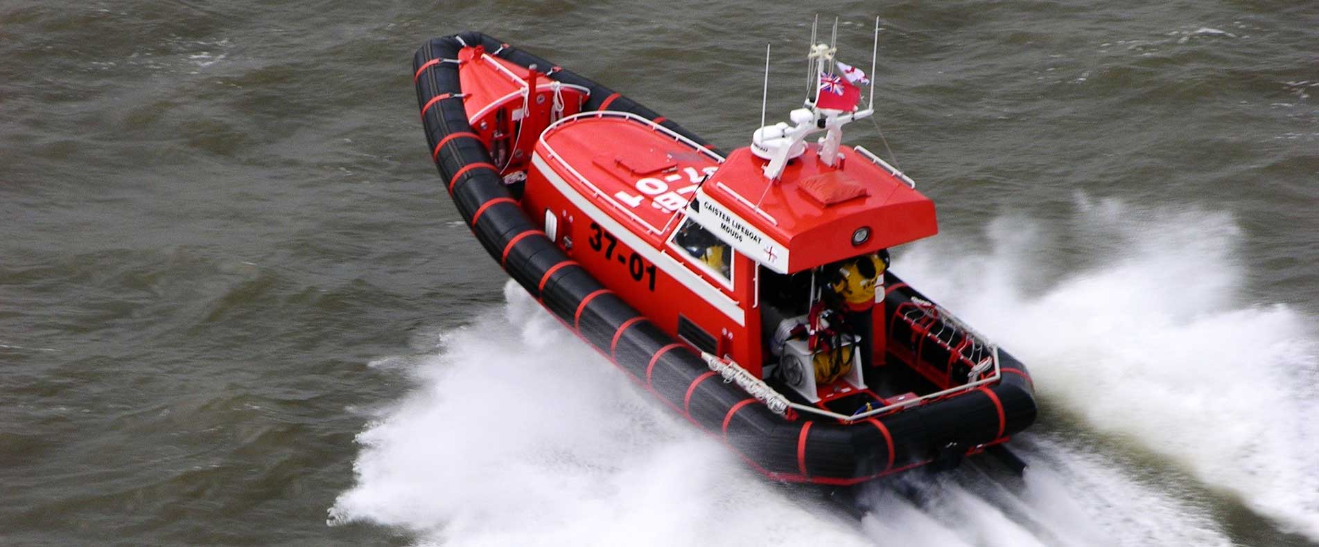
Caister Lifeboat has been saving lives at sea since 1791. Completely independent, they depend entirely on public donations to help provide safety and rescue services to the countless vessels, crews and beach visitors to this area of the East Coast of England. We are proud to support this vital charity - developing a new website to provide details of their latest rescues - or "shouts" as they are known - and most importantly to encourage donations. Client: Caister Volunteer Lifeboat Service Design, build & management: Brand Skillings
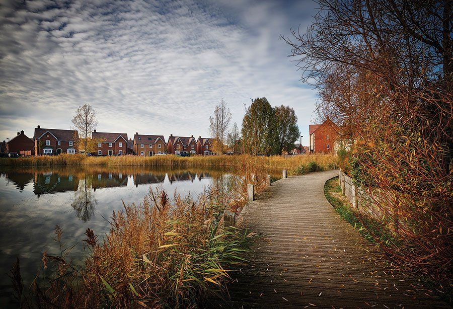
The brief from L&Q Estates was for a high-end brochure, with exemplary production values, that told the story of the Wixams development - taking an industrial site that had seen better days and transforming it into an aspirational new village community. The resulting 32pp brochure features a wealth of newly commissioned photography by Julian Calverley, together with historical research, copywriting, design and creative direction from Brand Skillings. Commissioned by: Ian Hardwick, Managing Director Client: L&Q Estates Design & management: Brand Skillings Photography: Julian Calverley Art direction: Nick Brand Print: Colt Press
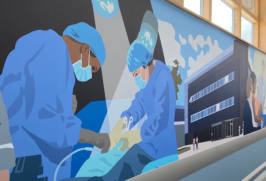
The brief from the University of Greenwich was to produce a 22m wall mural depicting teaching and multi-purpose disciplines in nursing and care.

How e-newsletters can help get you restarted after lockdown, combining effective messaging, a highly targeted approach and real-time analytics.
Most people have heard of the term, but what does rebranding really mean - and when is the right time to make a start?

We prioritise transparency in our business approach - so we have included answers to some of the questions we are most often asked by new clients...

You can’t help but notice that the overall look of many new websites is now more minimalistic. Nick Brand discusses this design trend...
Great BRITISH Branding
Brand Skillings
Brand Skillings Ltd
K1 Building
Kents Hill Business Park
Timbold Drive
Kents Hill
Milton Keynes
MK7 6BZ
Tel:
01908 610768